


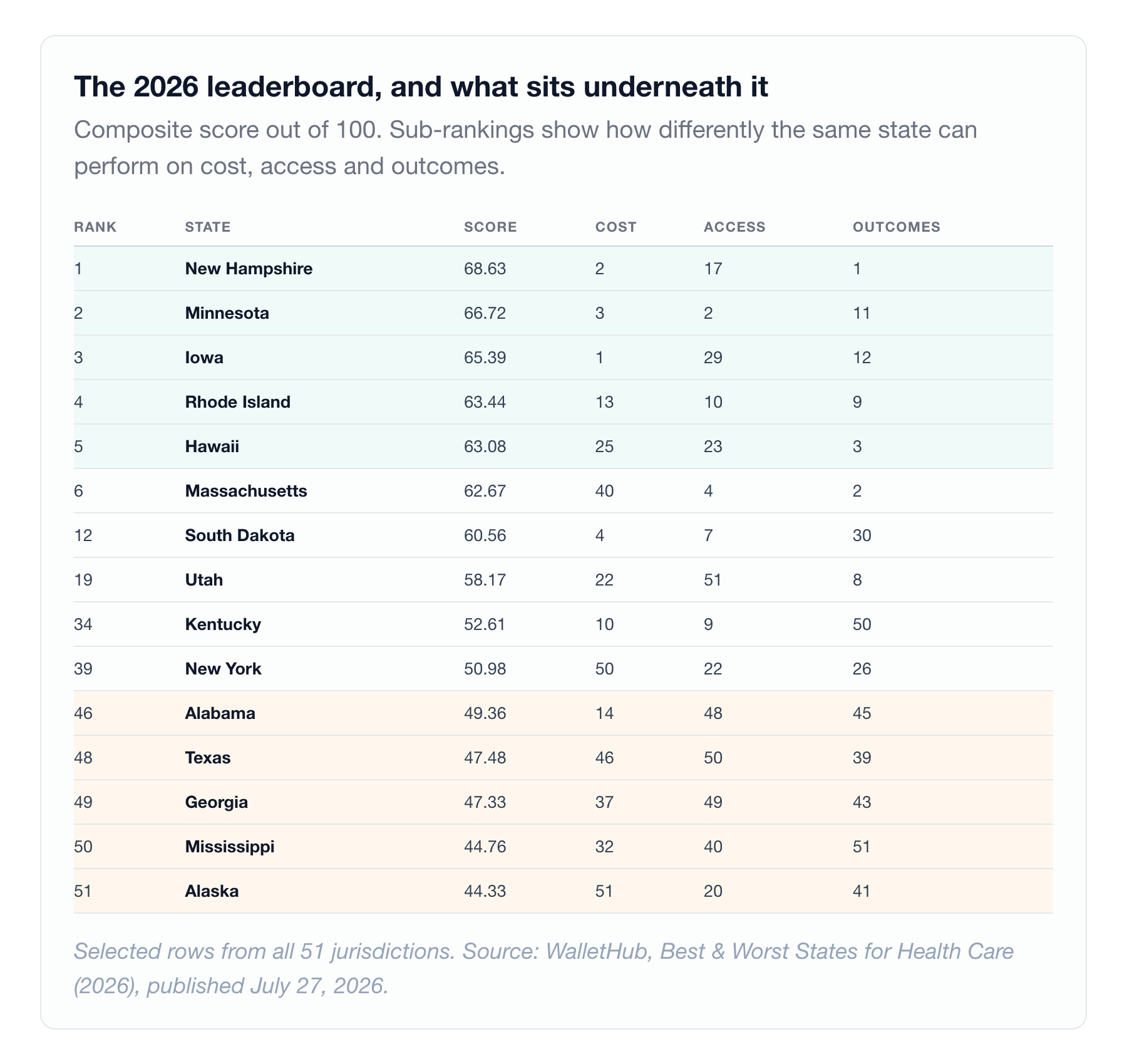
WalletHub published its 2026 healthcare state rankings on Monday 1. New Hampshire took first place with a composite score of 68.63, driven by the best outcomes score in the country and the second-best cost score. Mississippi finished 50th. Alaska finished 51st.
Those are real findings from a defensible methodology. Forty-four metrics, three equally weighted dimensions, life expectancy double-weighted inside outcomes. If you are deciding where to retire, where to relocate a family, or where to site a workforce, that composite is genuinely useful information about the average experience of the average resident.
Now hold it next to the map of federally designated traumatic brain injury centers.
There are sixteen TBI Model System centers in the United States, funded by NIDILRR, distributed across fourteen states 2. New Hampshire has none. Iowa, which ranked third, has none. Rhode Island, fourth, has none. Hawaii, fifth, has none.
Alabama, which WalletHub ranked 46th, has one. Georgia, ranked 49th, has Shepherd Center, one of the most recognized brain injury rehabilitation programs in the country.
America's number one healthcare state has no federally designated brain injury center. Its number 49 state has one of the best in the country. Both facts are true, and they are measuring completely different things.
Neither ranking is wrong. They are answering different questions, and the gap between those questions is where patients get hurt.
What a state ranking actually measures
WalletHub's methodology is worth reading closely, because the weighting is the whole story 1.
Cost gets 33.33 points across six metrics: cost of a medical visit, average hospital expense per inpatient day, cost of a dental visit, average monthly insurance premium, share of adults with high out-of-pocket spending, share of adults who skipped a doctor visit because of cost.
Access gets 33.33 points across twenty-four metrics: hospital beds per capita, physicians and nurses and geriatricians and PAs and paramedics per capita, emergency response and wait times, urgent care density, rural health clinic access, insurance coverage, resident retention, Medicare and Medicaid acceptance rates, telehealth adoption.
Outcomes gets 33.33 points across fourteen metrics, with life expectancy weighted double: infant, child and maternal mortality, readmissions, cancer incidence, stroke and heart disease incidence, diabetes prevalence, preventive care use, immunization rates.
Read that list again and notice what is absent. There is no metric for thrombectomy capability. None for NCI designation. None for inpatient rehabilitation capacity, transplant volume, Level I trauma coverage, or whether the nearest comprehensive stroke center is twenty minutes or two hours away. The methodology counts hospital beds per capita. It does not ask what those beds can do.
That is not a flaw. It is a scope decision, and it is the correct one for a population-level index. But it means the resulting number describes the floor of the system, not its ceiling. Those are different infrastructures, they are built by different forces, and they concentrate in different places.
Two credible rankings, two different answers
The clearest evidence that composite rankings are answering a chosen question rather than a fixed one: run the same country through a different weighting and the leaderboard reshuffles.
The Commonwealth Fund's 2025 Scorecard on State Health System Performance scores 50 indicators across four dimensions using 2023 data. Its top performers are Massachusetts, Hawaii, New Hampshire, Rhode Island, and the District of Columbia 3. Massachusetts ranks first for affordability and access, with the country's highest childhood vaccination rate, highest insurance coverage, lowest infant mortality, and fewest premature avoidable deaths. Its lowest performers are Mississippi, Texas, Oklahoma, Arkansas and West Virginia, four of which also sit in WalletHub's bottom ten. The two indexes disagree far more at the top than at the bottom.
WalletHub places Massachusetts sixth and the District of Columbia fortieth.
Both are right. Massachusetts has the second-best outcomes score in WalletHub's own data and ranks 40th of 51 on cost. Give cost a full third of the weight and Massachusetts drops. Weight coverage, equity and avoidable mortality and Massachusetts leads the nation. Only New Hampshire and Rhode Island appear in both top fives.
When two rigorous rankings disagree this sharply, the disagreement is not noise. It is the weighting scheme becoming visible. Before you cite a state rank, ask what the index decided to care about, because that decision is doing more work than the underlying data.
The internal contradictions inside a single ranking are just as instructive. Kentucky ranks 9th in access and 50th in outcomes: care is reachable, and it is not working. Utah ranks 8th in outcomes and 51st, dead last, in access, a healthy population with the thinnest clinical workforce in America. South Dakota ranks 4th in cost and 30th in outcomes, and we will come back to South Dakota. New York ranks 50th in cost and 26th in outcomes, the most expensive care in the country buying a middling result.
A single composite number smooths all of that into one rank. The smoothing is the point of an index, and it is also what makes an index dangerous to use for a clinical decision.
The cardiovascular map
Heart disease is the leading cause of death in the United States, and its geography is not the geography of the rankings.
CDC's own state-level series, age-adjusted deaths among adults 35 and older averaged over 2021 to 2023, puts heart disease mortality at 498.8 per 100,000 in Oklahoma, the highest in the country, followed by Mississippi at 475.0, Alabama at 454.8, Louisiana at 436.4 and Arkansas at 434.3 4. At the other end: Minnesota at 237.7, Hawaii at 243.3, Colorado at 253.9 and Massachusetts at 255.5.
The spread is 2.10x. An Oklahoman is more than twice as likely to die of heart disease as a Minnesotan, age adjusted. A separate CDC all-ages series for 2024 produces different absolute numbers, 254.3 in Oklahoma against 116.3 in Alaska, but the same top five and a near-identical 2.19x spread 5. The ordering is robust across both series. The absolute values are not comparable between them, so do not mix them.
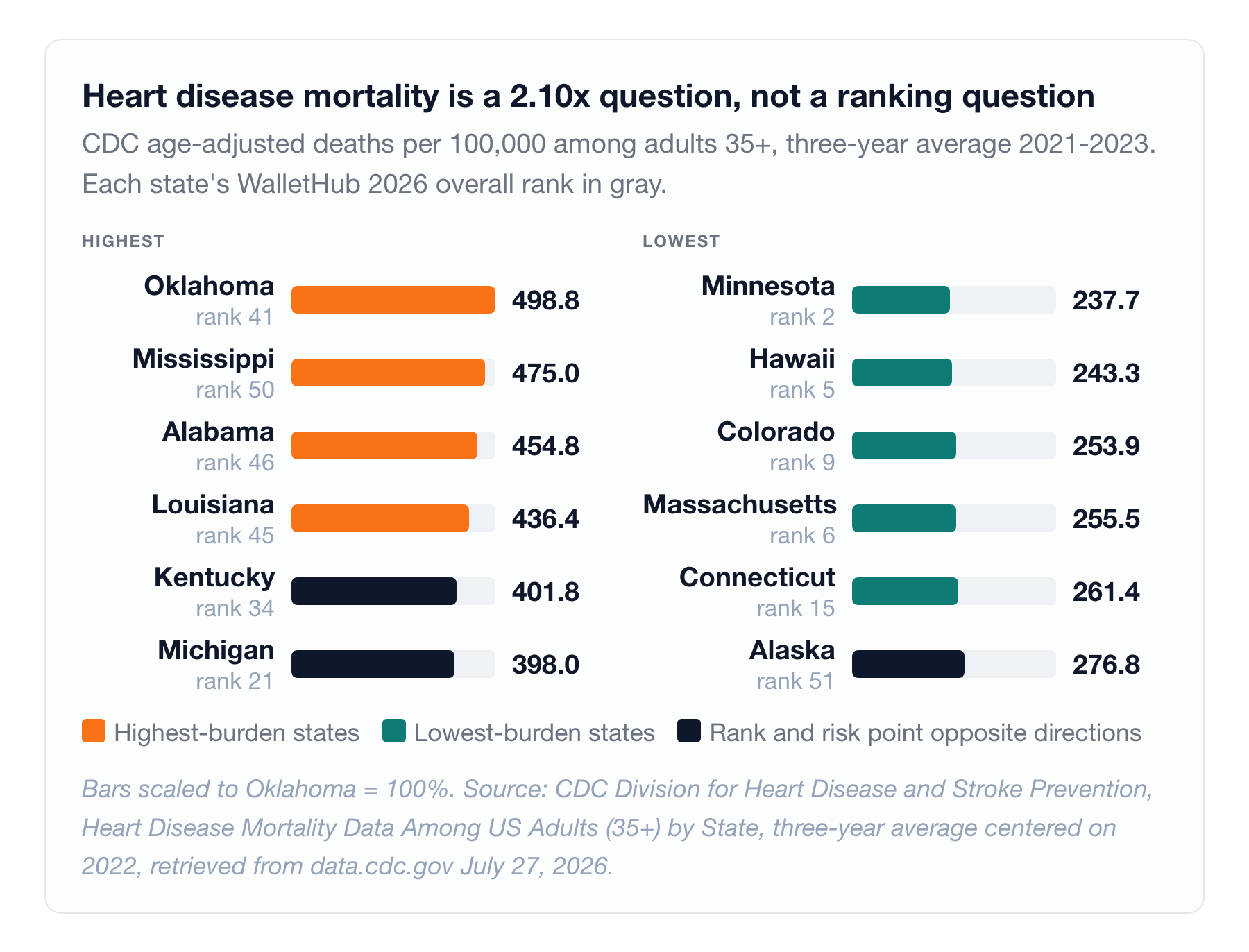
Now overlay the rankings. Alaska finished 51st of 51 on WalletHub, dead last, with the worst cost score in the country. It also sits in the best-performing quartile for heart disease mortality, 45th of 51 at 276.8, and better than the national median for stroke 4. A composite built on cost and access punishes Alaska severely and tells you very little about your cardiac risk there.
Run it the other direction. Michigan ranks 21st overall, comfortably mid-pack, and carries the ninth-worst heart disease mortality in the country at 398.0 and the tenth-worst stroke mortality at 87.5 4,7. Two separate cardiovascular outliers, both invisible in a middle-of-the-table composite. Kentucky ranks 34th and is eighth-worst for heart disease at 401.8.
Stroke behaves the same way and worse, because stroke has a named geography. The Stroke Belt, Mississippi, the Carolinas, Tennessee, Arkansas, Georgia, Alabama and Louisiana, carries stroke mortality at least 10% above the national rate, a pattern first identified in the 1960s and still intact today 6. The national all-ages stroke death rate was 39.0 per 100,000 in 2023, down slightly from 39.5 the prior year.
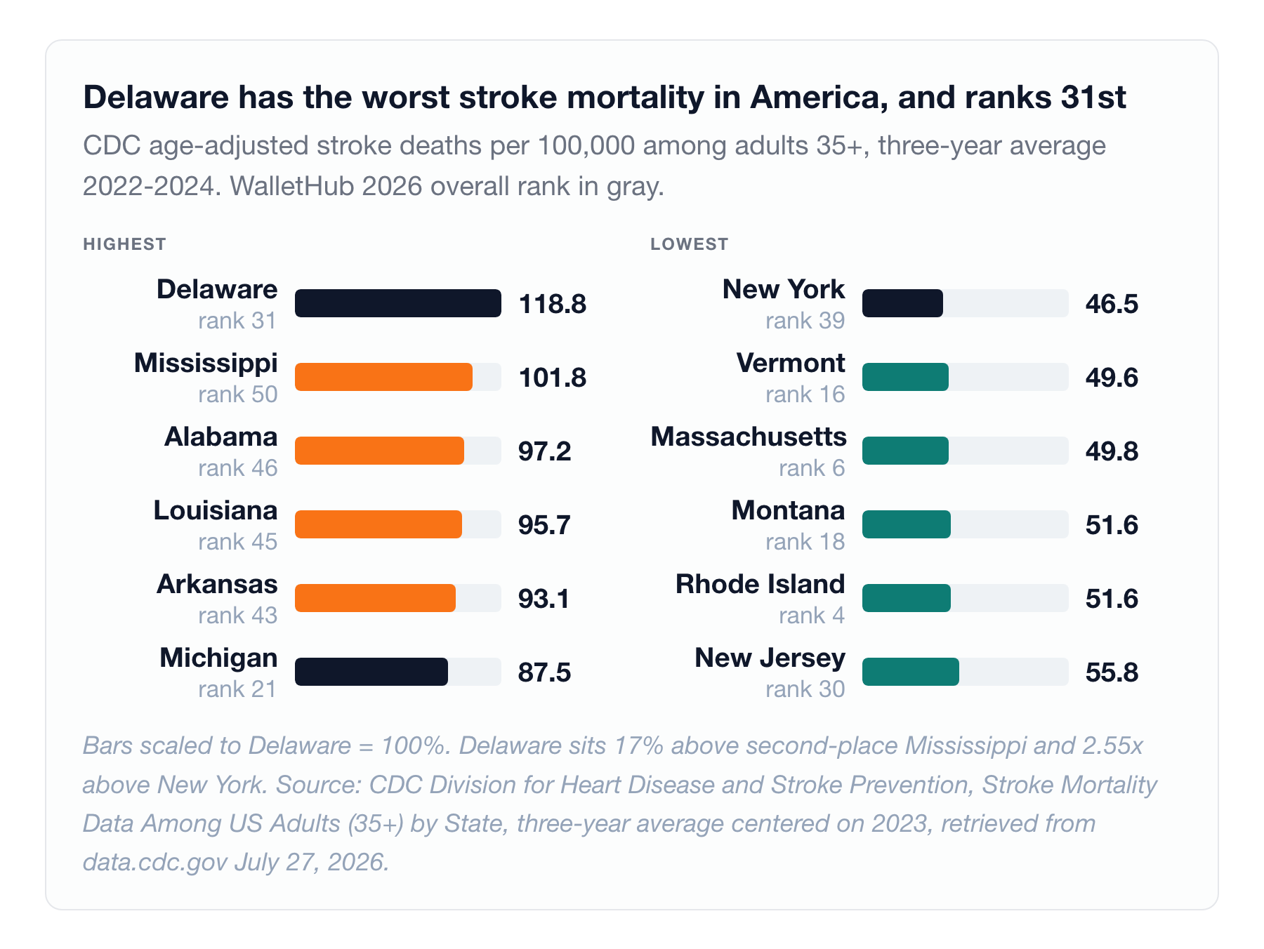
And the state-level picture contains a genuine outlier that no ranking surfaces. In CDC's 35-and-older series averaged over 2022 to 2024, Delaware has the worst stroke mortality in the United States at 118.8 per 100,000, sitting 17% above second-place Mississippi at 101.8, then Alabama at 97.2, Louisiana at 95.7 and Arkansas at 93.1 7. The lowest are New York at 46.5, Vermont at 49.6, Massachusetts at 49.8, and Montana and Rhode Island tied at 51.6. Delaware's rate is 2.55 times New York's.
Delaware ranks 31st on WalletHub. Nothing in that composite tells you it is the worst state in America to have a stroke.
The equity gradient inside that number is the part that should stop a health system executive cold. Among adults aged 45 to 64, Black men in the South die of stroke at 65.7 per 100,000, roughly 1.5 times the equivalent rate in the Northeast, and 2 to 3 times the rate of any other group of men in any region 8. The regional gradient holds across every demographic group examined. It is steepest here.
Stroke mortality in the American South has been elevated for sixty years, it is worst for Black men, and no state healthcare ranking in circulation reports it. The index measures stroke incidence. It does not measure who survives.
The stroke center data does not exist
Here is where the reporting hits a wall worth naming out loud.
You would want, at this point, a table of Comprehensive Stroke Centers by state. Comprehensive Stroke Center certification is the top tier: 24/7 neurointerventional capability, the ability to perform mechanical thrombectomy, dedicated neuro ICU. For a large vessel occlusion, the difference between reaching one and not reaching one is measured in disability-free years.
That table is not publicly available for 2026. The most recent peer-reviewed national inventory of US stroke centers runs on 2018 data, was published in 2022, and counted 297 Comprehensive Stroke Centers against 1,459 Primary Stroke Centers and 678 Acute Stroke Ready hospitals 9. Since then, individual states have maintained their own designation lists in incompatible formats, Texas through DSHS, Connecticut through DPH, North Carolina through DHHS, Louisiana through LERN, and no current aggregated national count is published in citable form.
Sit with that. The United States cannot readily tell a patient how many of its highest-level stroke centers each state operates. We rank states on dental visit cost to two decimal places, annually, and we cannot produce a current national count of the facilities that perform thrombectomy.
The cancer map
Cancer mortality shows the sharpest divergence between disease burden and treatment infrastructure of any condition examined here.
Age-adjusted cancer death rates for 2023: the national rate was 141.5 per 100,000, down from 200.7 in 1999, a 29.5% decline, with mortality falling in every single state over that span 10. That is one of the genuine public health achievements of the last quarter century and it deserves to be said plainly.
The state spread: Kentucky highest at 181.1, 28.0% above the national rate, then West Virginia at 172.0 and Mississippi at 171.5. Hawaii lowest at 118.5, then New York at 120.3 and Utah at 122.5.
Now the treatment infrastructure. NCI-designated cancer centers sit in 37 states plus the District of Columbia, meaning 13 states have none 11. They are heavily concentrated. California holds nine and New York eight, between them a quarter of the national total. Pennsylvania has five. Florida and Texas have four each. Illinois and North Carolina have three each. Nine more states hold two apiece: Arizona, Indiana, Maryland, Massachusetts, Michigan, Minnesota, Ohio, Tennessee and Virginia. Everywhere else has one or none.
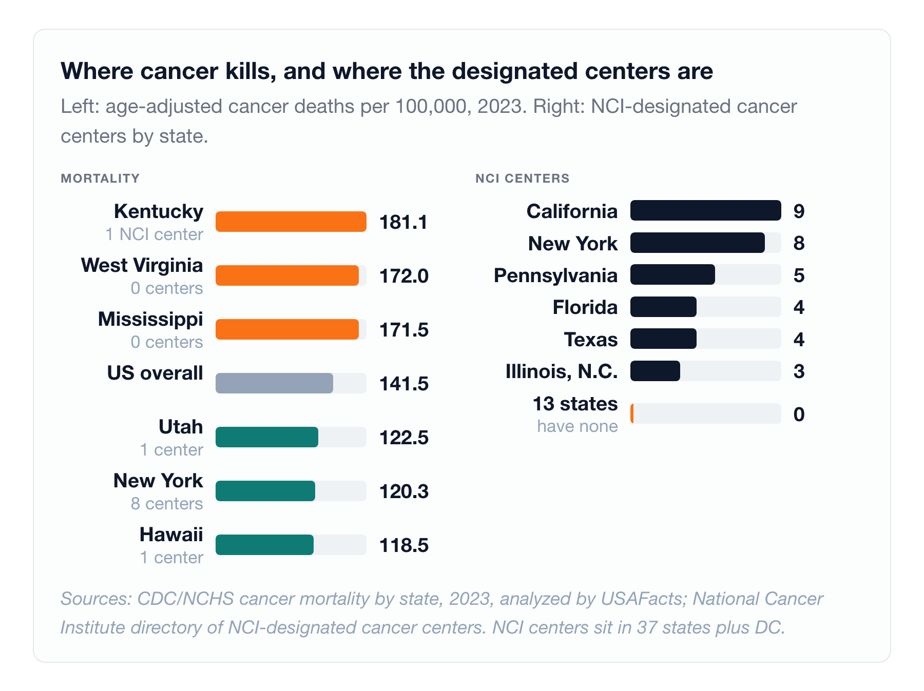
Kentucky has the worst cancer mortality in the country and one NCI center. New York has the second-lowest mortality and eight.
Be careful with that comparison, because it invites a causal story the data does not support. Hawaii has the lowest cancer mortality in America with a single Clinical-designated center, no Comprehensive designation at all. Population health, smoking prevalence, obesity, screening rates and age structure are doing enormous work in these mortality figures, arguably more than center density. Kentucky's cancer mortality is inseparable from Kentucky's smoking history.
But hold both readings. Population risk determines how many people get cancer. Access to a designated center shapes what happens to them next: trial availability, multidisciplinary tumor boards, surgical volume in rare tumors, molecular profiling as standard rather than exception. A patient in a state with no NCI center is not doomed. They are, measurably, further from the frontier, and for a rare or aggressive tumor that distance is the variable that matters most.
The brain injury map
TBI is where the ranking is least useful and the human stakes are highest, because brain injury is the condition where the acute event is the smallest part of the story.
The national numbers, from CDC: 68,663 TBI-related deaths in 2023, roughly 190 per day. Approximately 214,110 TBI-related hospitalizations in 2020, about 586 per day. Adults 75 and older account for roughly 32% of TBI hospitalizations and 28% of TBI deaths, the highest-burden group in the country. Males are about twice as likely to be hospitalized and three times as likely to die from TBI as females 12.
Notice what is missing from that paragraph. There is no current, citable, state-level TBI mortality or incidence rate published nationally. For a condition that kills 190 Americans a day and disables far more, the state-by-state burden is effectively unmeasured. Which means no state healthcare ranking could include it even if it wanted to.
What we can map is capability. The sixteen TBI Model System centers, the federally designated programs that anchor brain injury rehabilitation research and care in the United States, sit in fourteen states 2. New York and Texas hold two each: NYU Rusk Rehabilitation and Mount Sinai in New York, and the TIRR Memorial Hermann / Baylor / UTHealth collaborative alongside Baylor Scott & White's North Texas system in Texas. Twelve states hold one each: UAB in Alabama, Craig Hospital's Rocky Mountain Regional Brain Injury System in Colorado, Shepherd Center in Georgia, the Rehabilitation Hospital of Indiana with Indiana University, Spaulding-Harvard in Massachusetts, Wayne State's Southeastern Michigan system, Mayo Clinic in Minnesota, the Kessler Foundation's Northern New Jersey system, Ohio State, Moss Rehabilitation Research Institute in Pennsylvania, Virginia Commonwealth University, and the University of Washington.
Fourteen states. Thirty-six states have none.
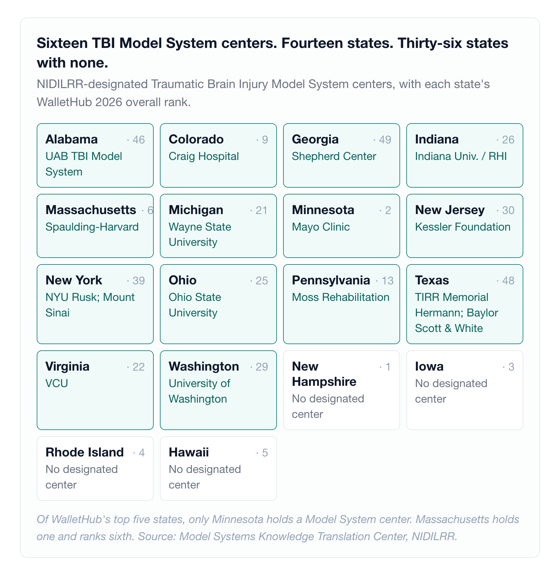
Overlay that against the ranking and the mismatch is total. Of WalletHub's top five, exactly one state holds a Model System center: Minnesota, at number two, through Mayo. Numbers one, three, four and five have zero. Massachusetts holds one and ranks sixth. Meanwhile Alabama at 46th, Georgia at 49th and Texas at 48th each hold one or two.
This is the cleanest demonstration in the entire dataset that a state ranking and a disease-specific capability map are different documents that happen to share an x-axis.
For a moderate to severe TBI, the acute hospitalization is days. The rehabilitation is months to years, and it determines whether someone returns to work, drives again, or lives independently. Every state ranking in circulation scores the days and ignores the years.
The financial map
Now the money, because the financial geography does not track the outcome geography either, and the mismatches are expensive.
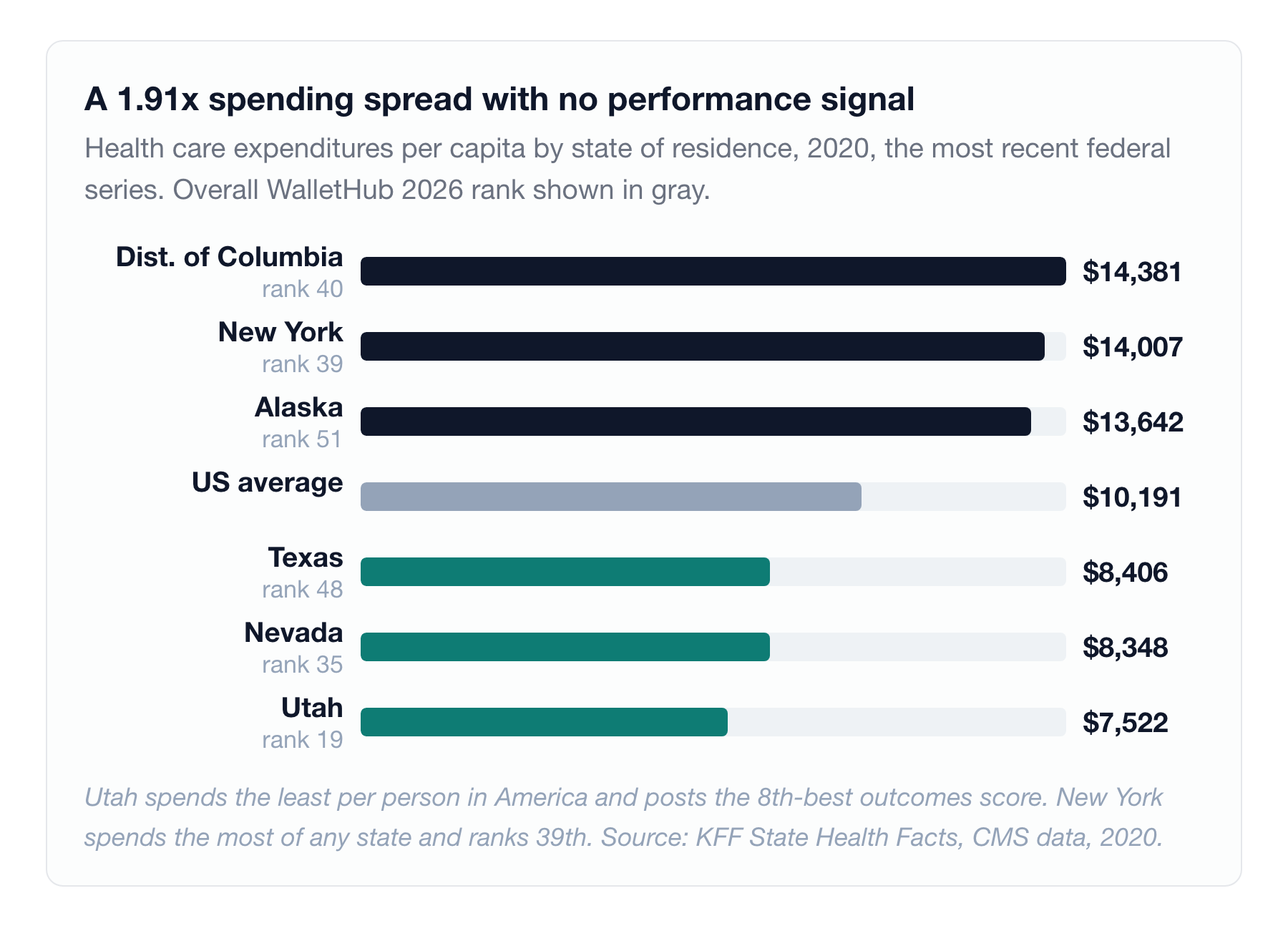
The most recent CMS series on health spending by state of residence, 2020 data, puts national spending at $10,191 per capita. Highest: DC at $14,381, New York at $14,007, Alaska at $13,642. Lowest: Utah at $7,522, Nevada at $8,348, Texas at $8,406 13. A 1.91x spread.
Utah spends the least per person in America. It ranks 19th overall on WalletHub with the eighth-best outcomes score in the country. New York spends the most of any state and ranks 39th with the second-worst cost score in the country. At the state level, spending is not a proxy for performance, and any executive who has argued a budget on the premise that it is should read those two lines twice.
RAND's Round 5.1 hospital price transparency study analyzed $77.4 billion in hospital spending across more than 4,000 hospitals using 2020 to 2022 claims, covering every state except Maryland, which sets hospital rates for all payers. Private plans paid hospitals an average of 254% of Medicare rates: 254% for inpatient facility services, 279% for outpatient, 184% for professional services 14.
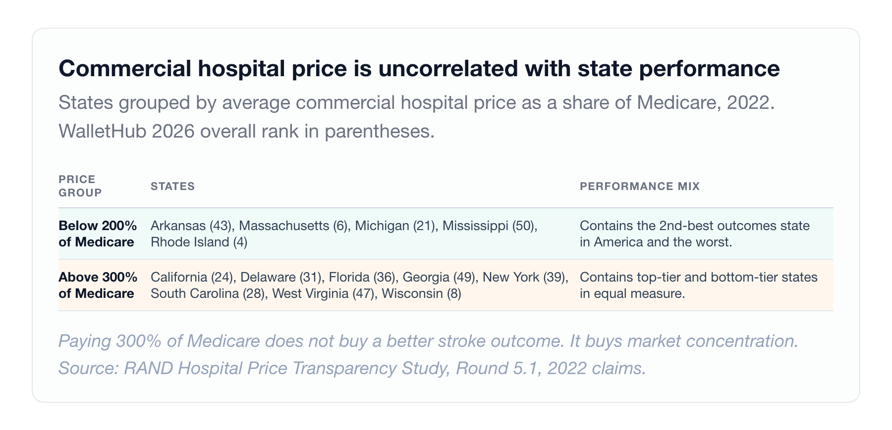
The state variation is where it gets uncomfortable. Below 200% of Medicare: Arkansas, Massachusetts, Michigan, Mississippi, Rhode Island. Above 300% of Medicare: California, Delaware, Florida, Georgia, New York, South Carolina, West Virginia, Wisconsin.
The above-300% group contains California and Wisconsin, both strong performers, alongside Georgia, West Virginia and South Carolina, all bottom-tier. The below-200% group contains Massachusetts, which has the second-best outcomes score in the country, sitting next to Mississippi, which has the worst.
Commercial hospital price and clinical quality are uncorrelated at the state level. Paying 300% of Medicare does not buy a better stroke outcome. It buys market concentration.
And then the finding that should reframe how you read any cost ranking. Urban Institute's Debt in America 2025, built on August 2025 credit bureau records, puts the share of adults with medical debt between 2.3% in Hawaii and 17.7% in South Dakota, a 7.7x spread, with seven of the ten highest-burden states in the South and Southeast 15. Roughly 8 to 9% of US adults carry medical debt in collections.
One caveat that cuts directly against the ranking: the 2025 update excludes seven states entirely, because those states passed laws restricting medical debt reporting on credit reports 15. The measure is a credit-reporting artifact as much as a hardship measure, and states that legislated the reporting away drop out of the comparison rather than improving in it. Read the spread as directional.
South Dakota ranks 12th overall on WalletHub with the fourth-best cost score in the country, and carries the highest medical debt prevalence in America.
Those two facts are not in conflict. They describe different stages of the same transaction. WalletHub measures posted prices and premiums. Urban measures what went unpaid and got sold to a collections agency. A state can have low sticker prices and aggressive billing, thin financial assistance policies, and a population without the liquidity to absorb a deductible. Affordability is a billing and collections outcome, not a price-list outcome, and no state healthcare ranking currently measures it.
Add coverage. The national uninsured rate is 8.2%. Texas sits at 16.7%, the highest in the country, and holds roughly 42% of the entire national coverage-gap population. Massachusetts sits at 2.6%, the lowest, on the strength of a 2006 state law that became the ACA's template 3. Ten states had not adopted Medicaid expansion as of 2026: Alabama, Florida, Georgia, Kansas, Mississippi, South Carolina, Tennessee, Texas and Wyoming, plus Wisconsin.
And the baseline everyone actually pays: the average annual employer family premium reached $26,993 in 2025, up 6%, with workers contributing $6,850 out of pocket. Single coverage averaged $9,325 16.
Where the ceiling actually is
One more overlay. US News evaluated more than 4,400 hospitals for its 2025-26 Best Hospitals rankings on risk-adjusted mortality, preventable complications and nursing care. The Honor Roll is 20 hospitals across 13 states 17.
Massachusetts has two. New York has three. Illinois has two. California has four. Thirty-seven states have none.
Florida ranks 36th on WalletHub and holds an Honor Roll hospital in AdventHealth Orlando. New Hampshire ranks 1st and holds none.
Stack the three capability maps, NCI centers, TBI Model Systems, Honor Roll hospitals, and the same handful of states appear repeatedly: California, New York, Massachusetts, Pennsylvania, Texas, Ohio, Michigan, Minnesota. That is the ceiling map. It is a map of academic medical centers, NIH funding flows and metropolitan density. It has almost nothing to do with what a routine office visit costs in the same state.
How to actually use this
The operational distinction that resolves all of the above is not geographic. It is temporal.
Time-critical conditions are geography-bound. Stroke, STEMI, severe trauma, ruptured aneurysm. You do not choose your hospital. Your EMS system chooses it for you inside a window measured in minutes, and your outcome is determined by drive time, prehospital routing protocol and transfer agreements. For these conditions the state map matters enormously, because it is functionally a map of transfer networks. The question is not "is my state ranked well," it is "what is the routing protocol from my address, and where does it send a suspected large vessel occlusion."
Destination-capable conditions are not geography-bound. Most cancers, TBI rehabilitation, complex elective surgery, transplant, rare disease. There is time to travel. For these conditions the state map is nearly irrelevant and the center list is everything. A patient in Wyoming with a rare sarcoma is not limited to Wyoming. They are limited by whether anyone tells them that, and by whether their insurance network makes the referral survivable financially.
Most patients, and most employers designing benefits, apply the wrong map to the wrong condition. They move to a well-ranked state and assume they are covered for everything, or they stay in a poorly ranked one and assume nothing good is reachable. Both are errors of the same kind.
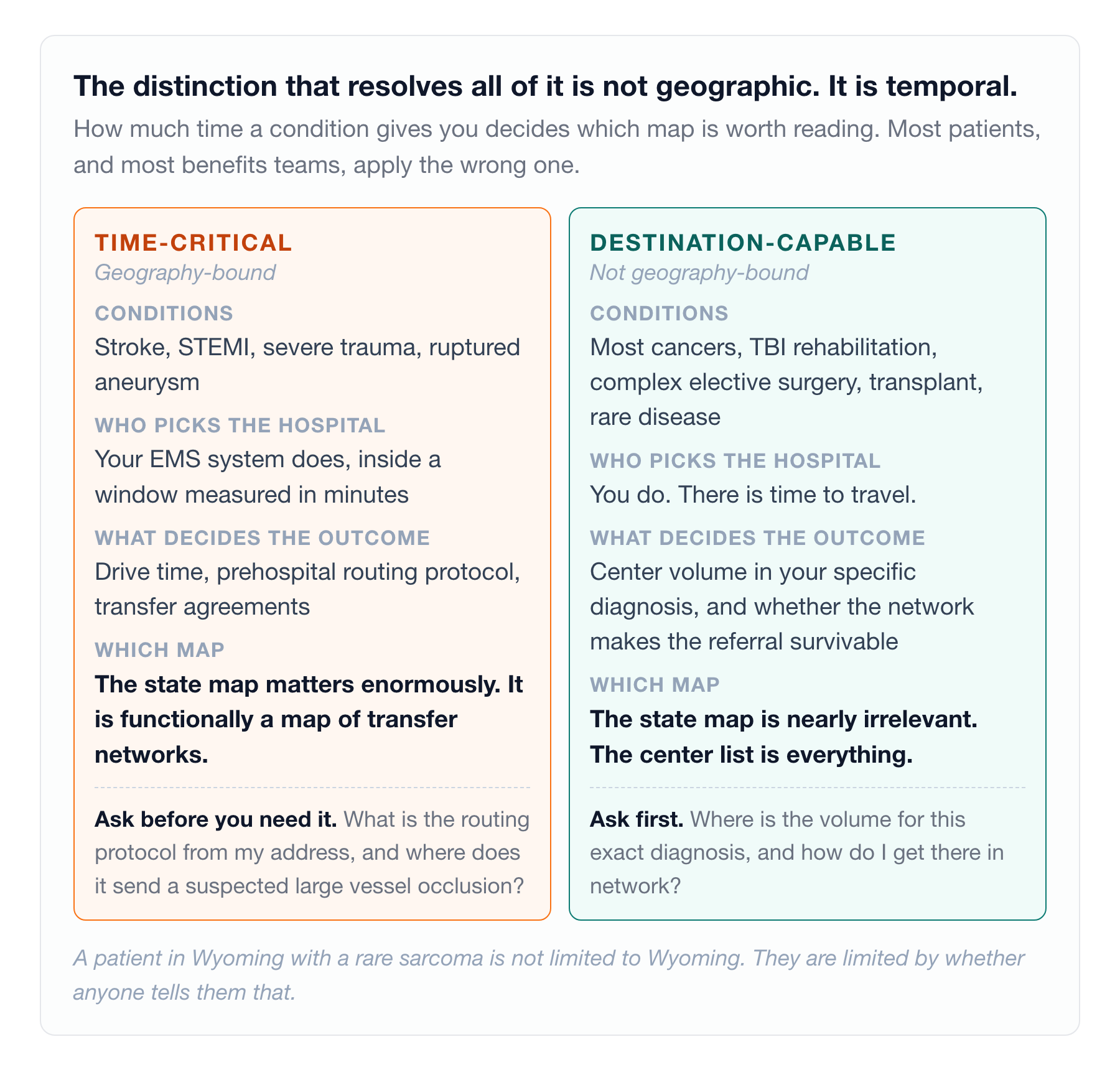
For a patient or family. For anything time-critical, learn your local EMS routing protocol and the nearest facility with 24/7 thrombectomy and neurosurgical coverage, and ask that question by name before you need it, because hospital marketing language for stroke capability is not standardized but certification level is. For anything destination-capable, start from the center list, not the state: find where the volume is for your specific diagnosis and work backward to how you get there. And before any planned admission, ask for the financial assistance policy in writing. South Dakota's numbers show that low prices and crushing debt coexist comfortably.
For an employer or health system, the same logic becomes three operating decisions. Network adequacy for your top three catastrophic diagnoses is worth more than headline discount. A plan priced at 300% of Medicare with no in-network comprehensive stroke center is a worse plan than one at 250% with one, and the RAND data shows price will not tell you which is which. Audit your transfer agreements before your outcomes. In a bottom-quartile state, the variable you control is not population health, it is whether a patient who needs a higher level of care gets there quickly and in-network. And measure medical debt in your own population, not premium cost. It is the number that predicts whether employees actually use the coverage you bought them.
What nobody is measuring
Six gaps surfaced in assembling this piece, and each one is a story of its own. There is no public 2026 count of Comprehensive Stroke Centers by state, because the last peer-reviewed national inventory published in 2022 and ran on 2018 data. There are no current state-level TBI incidence or mortality rates from CDC, only national figures, for a condition killing 190 Americans a day. The federal per-capita health spending series by state of residence is 2020 data, five years stale and still the best available. RAND's price benchmark runs on 2022 claims. Cancer mortality is 2023 and heart disease mortality is 2024, so cross-disease comparison is not year-matched and no national dashboard aligns them. And NCI's own summary page and live directory disagree on both center count (74 versus 71) and the number of states holding one (37 versus 39); counts here follow NCI's published summary language.
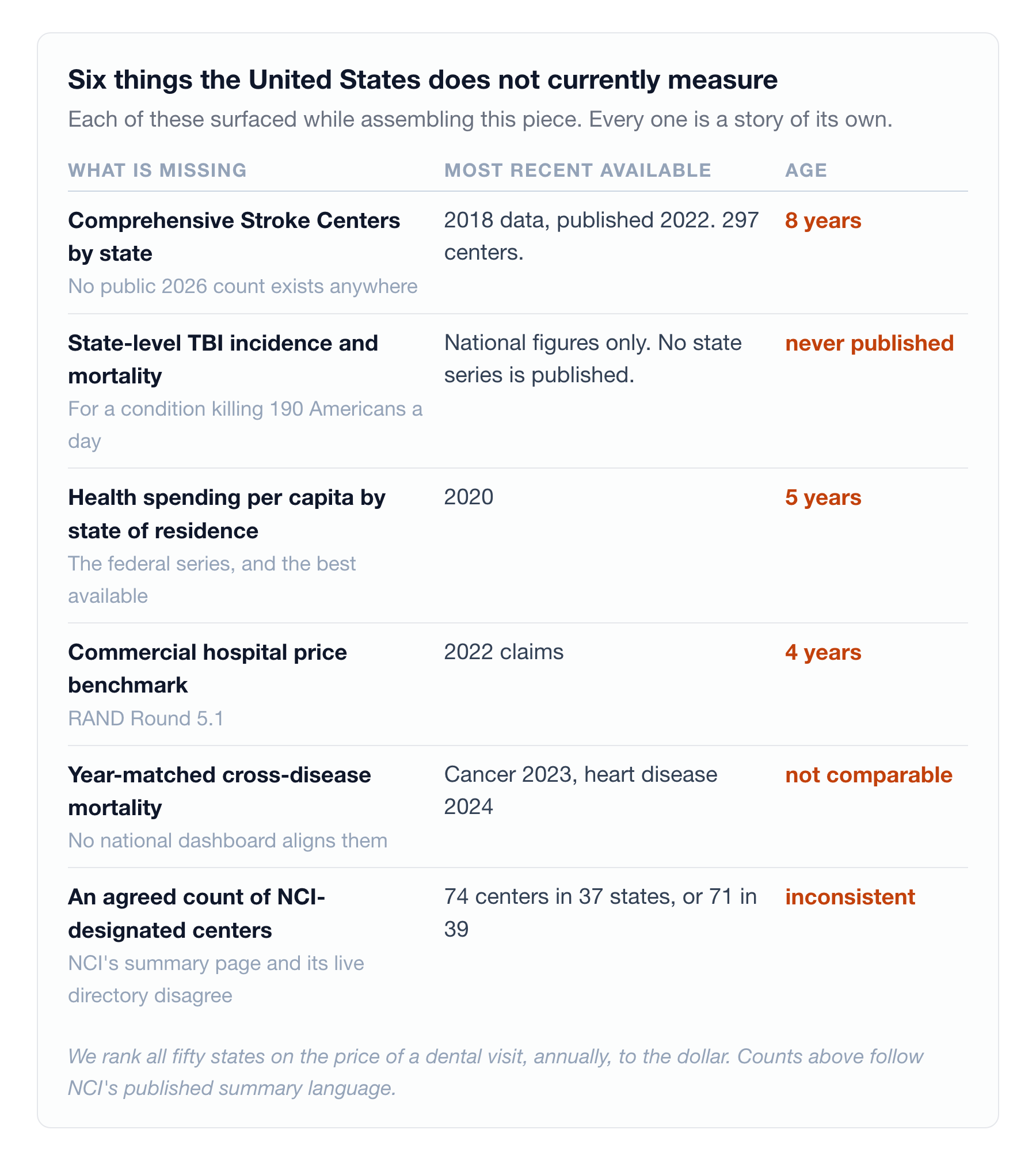
We can rank all fifty states on the price of a dental visit, annually, to the dollar. We cannot currently tell a family with a newly injured relative how many federally designated brain injury programs exist within driving distance, because nobody publishes it in a form they could use.
The rankings are not the problem. Mistaking the floor for the ceiling is the problem. A state can be the best place in America to be moderately unwell and the wrong place entirely to be catastrophically injured. New Hampshire is both. So, in the exact opposite direction, is Georgia.
Does your network actually cover the three diagnoses most likely to bankrupt your population?
A3HCS helps health systems, employers and post-acute operators read the capability map instead of the ranking: catastrophic-diagnosis network adequacy review, transfer-agreement and routing-protocol audits, brain injury and stroke service line assessment, and medical debt measurement inside your own population rather than headline premium cost. The state rank tells you about the average resident. It tells you nothing about the patient who is about to need the ceiling.
References
- WalletHub. "Best & Worst States for Health Care (2026)." Published July 27, 2026. 44 metrics across three equally weighted dimensions (Cost, Access, Outcomes). https://wallethub.com/edu/states-with-best-healthcare/23457
- Model Systems Knowledge Translation Center. "Traumatic Brain Injury Model System Centers." Sixteen NIDILRR-funded centers across fourteen states (NIDILRR grant 90DPKT0009). https://msktc.org/tbi/model-system-centers
- Commonwealth Fund. "2025 Scorecard on State Health System Performance." June 2025. 50 indicators across four dimensions, 2023 data. https://www.commonwealthfund.org/publications/scorecard/2025/jun/2025-scorecard-state-health-system-performance
- CDC Division for Heart Disease and Stroke Prevention. Heart Disease Mortality Data Among US Adults (35+) by State/Territory and County, 2021-2023. Age-adjusted three-year average rates; state-level records retrieved from data.cdc.gov (dataset th8y-thx5) and verified July 29, 2026. https://data.cdc.gov/Heart-Disease-Stroke-Prevention/Heart-Disease-Mortality-Data-Among-US-Adults-35-by/th8y-thx5
- CDC/NCHS all-ages age-adjusted heart disease mortality by state, 2024, reported via Becker's Cardiology, June 12, 2026. Different population base and single year; absolute values are not comparable to the 35-and-older series. https://www.beckerscardiology.com/cardiology/states-with-highest-lowest-heart-disease-mortality-rates-cdc/
- CDC. "Stroke Facts." National stroke death rate 39.0 per 100,000 in 2023, down from 39.5 in 2022. https://www.cdc.gov/stroke/data-research/facts-stats/index.html
- CDC Division for Heart Disease and Stroke Prevention. Stroke Mortality Data Among US Adults (35+) by State/Territory and County, 2022-2024. Age-adjusted three-year average rates; state-level records retrieved from data.cdc.gov (dataset y5ii-knwc) and verified July 29, 2026. https://data.cdc.gov/Heart-Disease-Stroke-Prevention/Stroke-Mortality-Data-Among-US-Adults-35-by-State-/y5ii-knwc
- Curtin SC. "Stroke Death Rates Among Adults Ages 45-64 by Region and Race and Hispanic Origin: United States, 2002-2022." NCHS Data Brief No. 505. National Center for Health Statistics, August 2024. https://www.cdc.gov/nchs/products/databriefs/db505.htm
- "An inventory of stroke centers in the United States." Published February 2022, reporting 2018 data: 297 Comprehensive Stroke Centers, 1,459 Primary Stroke Centers, 678 Acute Stroke Ready hospitals. https://pmc.ncbi.nlm.nih.gov/articles/PMC8886184/
- CDC/NCHS cancer mortality by state, 2023, analyzed by USAFacts. National age-adjusted rate 141.5 per 100,000. https://usafacts.org/articles/which-states-have-the-highest-cancer-rates/
- National Cancer Institute. "NCI-Designated Cancer Centers." https://www.cancer.gov/research/infrastructure/cancer-centers/find
- CDC. "Facts About TBI." 68,663 TBI-related deaths in 2023; approximately 214,110 TBI-related hospitalizations in 2020. https://www.cdc.gov/traumatic-brain-injury/data-research/facts-stats/index.html
- KFF State Health Facts. "Health Care Expenditures per Capita by State of Residence," CMS State Health Expenditure Accounts, 2020. https://www.kff.org/state-health-policy-data/state-indicator/health-spending-per-capita/
- RAND. "Prices Paid to Hospitals by Private Health Plans: Findings from Round 5.1 of an Employer-Led Transparency Initiative." $77.4 billion in hospital spending across more than 4,000 hospitals, 2020-2022 claims, all states except Maryland. https://www.rand.org/pubs/research_reports/RRA1144-2-v2.html
- Urban Institute. "Debt in America 2025." State-level medical debt from August 2025 credit bureau records, updated November 19, 2025. The 2025 update omits seven states that restrict medical debt credit reporting. https://datacatalog.urban.org/dataset/debt-america-2025
- KFF. "2025 Employer Health Benefits Survey." Average annual family premium $26,993, up 6%; worker contribution $6,850; single coverage $9,325. https://www.kff.org/health-costs/2025-employer-health-benefits-survey/
- US News & World Report. "Best Hospitals 2025-26 Honor Roll." 20 hospitals across 13 states, from more than 4,400 hospitals evaluated. https://health.usnews.com/health-care/best-hospitals/articles/best-hospitals-honor-roll-and-overview